Friday, 16 November 2012

Exercise 5: Variety with a low sun.

The folly at the top of Mow Cop.
"This is an exercise to demonstrate some of the advantages of shooting when the sun is low.  Produce four photographs of a subject that must be lit by full sun showing each of the following:-

  • Frontal lighting, the sun behind the camera.
  • Side lighting, with the sun to the left or right.
  • Back lighting, shooting towards the sun.
  • Edge lighting, shooting towards the sun, in which the sun is outside the viewfinder frame".
I had problems similar to the last exercise, early morning mist, this can be seen from the picture above.  After about an hour the mist cleared so I was able to get the required photographs, they are in the order as listed above.


On the way home from Mow Cop I passed a cemetery where the sun was catching some of the gravestones, I decided to photograph these as a another example of lighting by by the low sun.  The pictures are in a slightly different order to the ones above, starting with front lighting then side,followed by edge lighting the last image is of course backlit.


Exercise 4: Light through the day.


"Take a detailed look at what happens to a view as the sun moves round throughout the day.  A sunny day will be needed for this exercise.  Photograph a scene from dawn till dusk, produce around 12 images, taking at least one per hour, more at the end of the day when the light is changing faster".

Because of our unpredictable weather especially during October, I knew a location close to home would have to be found for this exercise.  I decided on this clump of trees in the above photograph, the autumn colours attracted me also the lane they stand on runs north to south, this I thought would show best how the sun moves around a scene.  The weather forecast for 21st of October said it would be clear and sunny all day, perfect I thought.  I awoke to find it was very misty, this can be seen from this picture, it did clear by midday, so I was able to make a start.  It was the 2nd of November before there was another sunny day so I could finish the exercise, unfortunately in that time most of the leaves had fallen so the trees were no longer as colourful.


I would have liked to photograph the trees from the opposite direction, the way the picture at the beginning was taken.  Unfortunately this meant looking into the sun at certain times so I had no choice but choose the viewpoint in the above images.  The photograph taken at 13-25 is the best, I like the highlights and shadows on the road, something I had noticed when walking my dogs along this lane a few days earlier.  I like how the branches of the tree in the foreground catch the light and form a frame to the trees in the distance when they still have their autumnal colour, in the photographs taken between midday and sunset.

Exercise 3 : Judging colour temperature 1

"In most photography there is no need to be exact about colour temperature; it is enough to know when the light is not white, if only by a little, or by a lot.  For this exercise chose a subject that can be moved around and is not of a strong colour, also a clear sunny day is required.  Take three photographs, one in full sun during the middle of the day, next move the subject into the shade, taking a second picture, finally wait until the sun is close to the horizon for the last image.  Make sure the camera's white balance is set to daylight not automatic".

I used my dog Millie as the subject, she is predominately grey in colour, so perfect for the exercise.


All the images were taken at ISO400 with an aperture of f11, the shutter speeds varied as follows.  Midday sun was 1/250th sec, midday shade, 1/20th sec and the photograph taken at sunset 1/60th sec.  The photograph taken at sunset has the most obvious colour cast, my dogs coat has an orange tint to it, similar to the autumn colour of the leaves on the grass.  This was not so noticeable when I took the photograph, however I was aware of a warmth to everything.  As expected the midday sun image is closest to the true colour of my dogs coat, when I put Millie in an area of shade I could see that the overall image was going to come out with a blueish tint, giving the impression of being cold.

Judging colour temperature 2.

Having looked at the previous images, I would make changes to both the shade and sunset photographs.  This may be easier to say because I know how my dog should look.  A different subject, for example something colouful might have been ok with a setting sun, but most things would look wrong when photographed in the drab, cold and blueish light of shade.

"For part 2 take a similar subject to the last one, take the same three kinds of picture, for each one vary the camera's white balance setting.  In sun select daylight then shade and finally auto white balance, the same with the subject moved to a shady position and lastly at sunset.  Compare the three versions for each, what difference can be seen, which is the best white balance for each of the lighting conditions?"

Set 1 midday sun.

Set 2 midday shade.

Set 3 sunset.

Again I have the advantage of being able to look at Millie while judging the images.  In set 1 daylight WB is closest, shade WB for set 2 and auto WB in set 3.  Without being able to see the subject first hand, two photographs from each set are acceptable, I guess this shows how accurate the camera's white balance settings are and for most situations auto WB could be used.

Monday, 15 October 2012

Exercise 2: Higher and lower sensitivity.

'For the first part of this exercise take similar shots at both normal and high sensitivity, submit a minimum of 12 images.  Start at ISO 100 then change to higher sensitivities, compare the images close up.  Look in two kinds of area in the picture; those that are smooth with little detail also neither bright nor dark.  What is the obvious difference? '

I wanted a subject that was a little different and of course it had to be moving, the course book suggests a street market, something I had already photographed during the exercise about colour.  When I heard that our granddaughter was going to visit us and knowing how much she likes going to the play area, I had the idea of photographing her on the swings.  She would certainly be moving and we would both be having fun, Izzy loves going to the park and I would get the pictures I needed for this exercise.  I've included two sets of images, the first taken from the side, the second more head-on, which I feel shows the movement a lot better.  The speed of her swinging varied with the first set of images because Izzy was propelling herself, for the second set her Dad pushed her at a more controlled rate.  This gave me the opportunity to pre-focus, so eliminating any issues other than the blur caused by the movement of the swing.

Set one.

To make comparison easier I've added the ISO and shutter speed used to each image, the aperture remained constant at f16.  Although I was concerned about the speed of swinging with the first set of photographs, an ISO 3200 was the first picture of both sets that appears not to have any motion blur when viewed at 100%. The previous image, taken at ISO 1600 was acceptable if not enlarged too much, some noise can be seen at 1600 and above, however this is better than the blur caused by movement, assuming that was what was intended.  I have learned to accept some movement within my photographs, in fact I very often use a slow shutter speed to get this effect.  The bike riders in my last assignment are an example of the type of image I'm referring to, the first pictures in the sets above and below are others.  They are almost abstract or maybe impressionistic in style, this is nothing new I know, however it is new to my photography, I used to be obsessed by preventing movement of any kind.

Set two


Tuesday, 9 October 2012

Photography 1:- part four "Light"

Let there be Light. 

Exercise 1:  Measuring exposure.
Tulip stair in the Queen's house at Greenwich.

     'For the first part of this exercise produce four to six photographs which are deliberately lighter or darker than average, say why in written notes'.
     'Secondly produce at least 36 photographs of any subject, for each one make five exposures arranged around the best measured exposure.  The first should be one stop darker, the second half a stop, the third average, the fourth half a stop lighter and the fifth one stop lighter.  When viewing the images see whether or not the central exposure is, as you would expect it and what you wanted.  Next, which, if any of the other exposures are also acceptable?  Depending on the subject and the kind of lighting, you may find some differences'.  
     This is part of the brief taken from the course book for this exercise.  With the exception of one of the photographs they were taken in Liverpool, most of my time was spent around the Pierhead and along the Mersey river front.  This area is a wonderful mix of old and new buildings, somewhere I will certainly be visiting again.  


Taken from Grenwich park, not the best shot of the London skyline however I wanted a photograph that included this amazing sky.  The wind was blowing the clouds across quite quickly so I only had seconds to take this.  Luckily the best light is behind St Pauls, I waited, hoping it would move across to the Shard, sadly it didn't.  The thing that strikes me about this view is how many cranes there are in London, assuming they are all on construction sites, one might say, recession what recession!  Returning to the exercise, I exposed for the brightest part of the sky, because that was the main reason I had for taking the photograph, I knew this would put most of the scene into silhouette, with such a well know skyline I didn't think this was a problem.

With the remainder of the photographs I have included an image that was exposed at the camera's metered setting for comparison.  The darker of the two pictures above is closest to what I had seen at the time, the sky looked almost on fire, like the previous photograph taken in London, the sky was the most important element.


The top, darker photograph is how I saw the scene at first, the sun was highlighting the ferry boat, this side of the river was in shadow.  When the cloud drifted away the lighting was more even, still an acceptable image but not as interesting as the first, darker one.


My intention was to expose for the reflections of the older stone buildings, as seen in the modern glass architecture.  The lighter photograph works best and is nearest to what I saw, unfortunately the sky is washed out also some of the rich colours in the trees has been lost.


I saw this broken and abandoned umbrella in a park near Lime St station, it's purple handle really stood out. I thought it looked very forlorn just lying there, it must have broken in a gust of wind, its owner in a fit of temper just threw it down.  No thought that someone will have to clear it up or of how many times it must have kept the rain off them and maybe it could be repaired.  I'm wittering on again, the bottom, metered exposure is correct for the stonework but the umbrella is a bit washed out.  In the top darker image the colours and umbrella skin look much better, detail in the stonework is lost but it's not relevant to this photograph.

The second part of the exercise: Multiple exposures.

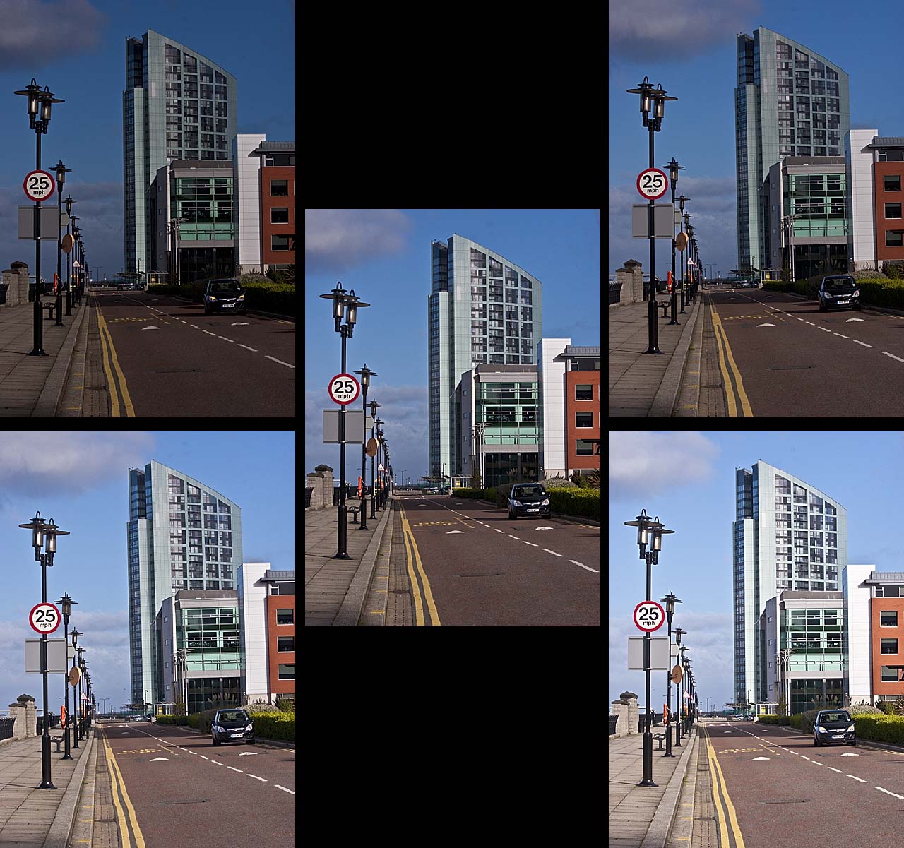
Each group of images is laid out in the same way: top left and right, one stop and a half stop darker respectively.  The central image is taken at the camera's metered exposure, the last two photographs in each group are, on the left, a half stop lighter and on the right one stop lighter.  The auto bracket on my camera only takes three exposures so for each set I took six images, then deleted one of the camera's exposures which of course had been duplicated.  Because one set was bracketed by one stop and the next  by half a stop, anything moving, for example people within each scene appear to jump around or in some cases disappear.


This scene has quite a lot of contrast, so I had expected problems with it.  The metered exposure is on the whole acceptable but a bit flat, I like the foreground and bridge in the one stop lighter image if it was combined with the sky and background of the half stop darker photograph.


If the pictures were numbered with one being top left, two top right, three in the centre, four and five are bottom left and right.  I find numbers three and four to be very similar and exposed ok.  One and two are much too dark with five being too light.


Image number four, a half stop lighter, seems about the best in this set when viewed at this size however the average exposure might look better if enlarged.


Again photo's three and four are acceptable, the last few images were all taken around the same time, midday, all have even lighting coming from over my shoulder, they are all a bit boring, probably due to the angle they were taken from.


This was taken with the sun at a different angle, coming from my left side, this is obvious by the shadows.  The camera's metered exposure is my favourite, good strong colours, with plenty of detail and shadows.


This is the new Museum of Liverpool, the photographs were taken with a polarizing filter on the lens, without it the glass in this building looks black, I prefer this effect.  The sun was at the front and side, this can be seen by the angle of the shadows.  It was glancing off the side of the Museum, so the windows are reflected in the block paving.  The first three images are quite good giving the effect that I was hoping for although I would have liked some figures in the foreground.


This time the sun is shining straight down the Albert dock promenade, again the shadows show it's position.  I had to turn the camera slightly to one side, so as not to get flare in the lens.  All but the last image are of an acceptable exposure, I like the way the light shows all the detail in the cobbles.


The shadows show that the sun is coming from the right hand side this time, this I feel has given a 3D effect to the picture, unlike some of the earlier images where the sun was behind the camera, they were very flat!  Photographs two, three and four are all quite good, the camera's metered exposure probably has the edge, proving that its metering system is fairly accurate. 

Sunday, 7 October 2012

My response to theTutor's report on assignment 3.

'This is a very considered response to the brief, by some measures one could call it exemplary and I particularly enjoyed the graphic qualities of your diagrammatic analysis of each image, some being more vivacious than the images they were taken from'.

This is how my tutor began his report on the third assignment, colour.  I read this and thought, great, then reading on I realized that not all of his comments were as positive.  

'You were a little too respectful of the brief, its more important to make interesting progressive images that approximate to what's requested than get it exactly right but make boring images in the process'.
At first I was a little down about his comments but realise now that he was correct.  The reason I'm doing the course, is because my photographs are often boring and lack imagination.  Clive is right when he says that I have answered the assignment to the letter and produced an acceptable result.  I guess this is how I've gone through life, always reading the instructions before assembling that flat packed chest of drawers from Ikea for example.  It's reminiscent of the comments used by some competition judges at my camera club, the worst of all being 'a good record shot'.  This course has without doubt helped me change as a photographer however its easy to slip back into the old ways.

I have always tried to produce a new set of images for each assignment, thinking that the ones used for the exercises were work in progress.  I agree with Clive when he says that some of the earlier photographs were of a higher standard than the majority of those in this assignment.  It took me a long time to complete this section of the course and now realise it was because the images were not good enough.

Having taken Clive's comments on board and looking again at my images, I had more creative photographs than the ones used, I did consider resubmitting the assignment, but because of time constraints this was never done.  However I have selected from my 'Colour Library' pictures that I beleive to be stronger than the originals.  The following page is included as a sample of these Images.