Monday, 19 March 2012

Project: Rhythm and Pattern.

Exercise:   Rhythms and Patterns.

Produce at least two photographs, one should convey rhythm, the other pattern.  Remember that in rhythm there needs to be a sequence in the picture, so that the eye will follow a direction and experience an optical beat.  Patterns work strongly when they fill the frame, so that the eye can imagine them continuing well beyond it.  


Percy the pigeon.


Taken at the same place as the photograph of "Percy".  They are both sections of the Tower road bridge at Birkenhead docks which I have used as a subject in other exercises.  I think the rivets and shadows make a very good pattern, had it not been sunny I might not have seen this image.  I will include a photograph of the whole bridge at the end.


I found it difficult to come up with pictures showing rhythm so I've included two.  Sometimes I look at this and see what the course book says, that there should be a sequence within the image.  The same applies to the photograph below, looking at the highlights running from top to bottom, I can see a sequence, but looking horizontally I can see a pattern.


Tower road bridge.
Now for assignment 2, which will be sent to my tutor on a memory stick, if I have the time I will add it to this blog.

Project: Shapes.

Exercise:  Real and implied triangles.


Spot the triangle!!!

Produce two sets of triangular compositions in photographs, one using 'real' triangles, the other making 'implied' triangles.

Real:

  • Find a subject which is itself triangular (a detail of something larger will do).
  • Make a triangle by perspective, converging towards the top of the frame.
  • Make an inverted triangle, also by perspective, converging towards the bottom of the frame.


Taken at Birkenhead, this steelwork forms part of the lifting bridge that carries Duke Street across the entrance to one of the docks.  Once I started looking, there were triangles all over this structure.  It would have been better had I used a slower shutter speed, some movement in the car might have given the image a bit more impact.


This was taken with my 70-200mm lens, looking down Atherton Street towards the promenade at New Brighton.  I realise now that I should have used a wide angle lens, using a telephoto has compressed the scene, so completely changing the perspective.  Lines have been added  to the image below, I hope they show what I was trying to convey with the photograph.


Until I started doing these exercises, I'd no idea how many shapes could be seen in everyday situations, like this one of dog walkers on New Brighton beach.  It was not a very good day, weather wise, but when taking this photograph I knew it had worked.  Just at the moment the shutter was pressed, the dog walkers moved into position, almost like formation dancers in a ballroom competition.  In actual fact only two of the groups are moving, the people on the right are stationary, they appear independent of each other, but at the same time there is a connection.  They are all talking, they are all in a line and will probably all go the same way down the beach.  Again I have included a picture with a diagram showing the relevant shape.


Implied:

  • Make a still-life arrangement of five or six objects to produce a triangle with the apex at the top.
  • Make a still-life arrangement as above, but so that the triangle is inverted, with the apex at the bottom.
  • Arrange three people in a group picture in such a way that either their faces or the lines of their bodies make a triangle.


For the still life I chose a few of the things that I take with me on my trips to get images for the course, therefore  keeping to my theme, the Wirral.  The camera is obviously not the one used every day, but one that I am fortunate to own.  It is a fully working replica of Oskar Barnack's O-series camera, it was re-produced by Leica in 2004.  The triangular shape to the set-up can easily be seen, however a diagram is included alongside each photograph.


I then rearranged the components of my still life, so the apex was at the bottom.


For the last image in this exercise, I photographed my grandchildren, Izzy and Jacob with their mum.  The set up is a natural one, all I had to do, was to get them to sit against a black background therefore keeping it simple.  There are several triangles within this picture, so as with previous photographs I have included diagrams.


Before starting part two of this course I was aware of how important composition was to a photograph, but not to what degree.  Shapes, I now know are a vital ingredient in any picture, I'm sure they will become the norm in my photographs from now on. When reading through Elements of design, I thought finding photographs of triangles, for example, the most difficult, in fact it turned out to be a lot easier than I had imagined.  I now see triangles in lots of things, and along with implied lines, the pictures I am now taking seem to be full of them.  Out of all the exercises I have done, curves gave me the most trouble, despite thinking that it would be one of the easier ones.  Still life has again given me a challenge, I can see how it can be very satisfying when done correctly, also how the shape of it is so important to the final result.

Friday, 9 March 2012

Project: Using lines in composition.

Exercise:    Implied lines.


Start by looking at these two photographs and find the implied lines in each, showing them in a small sketch diagram.  If one direction along a line is dominant, indicate this with an arrow.


 Then find three photographs of your own, and perform the same analysis.  


This was taken at St Pancras station before it became the London terminus for Eurostar.  There are several lines leading to the main subject, the train.  The shadows cast by the trolley, lead the eye, but more important I feel the angle of the doors direct you through the image.


I visited Glasgow in 2008, quite some time I know since it had been City of Culture in 1990.  This image I felt was such a contrast, showing a side of the city that I hope very few visitors see.   Although the woman in the red coat has her back to the camera, it is obvious that she is looking at the poster, so there must be an eye-line from her towards the woman on the advertising hoarding.


Walking down Brick lane in London's East end, I spotted this scene.  At the time I hadn't realised it's significance, but knew there was something I liked about the image.  I can know see that there are three eye-lines in this photograph.  The woman holding the ladder, the graffiti on the wall and the sheep's head, all have eyes looking at the man trying to put up some sort of flag.


For the third part of the exercise, plan and take two photographs that use the following kinds of implied lines to lead the eye:

  • An eye-line
  • The extension of a line, or lines that point.


Could it be that I am attracted to the colour or is red just very popular, so many of my photographs have red somewhere in them.  The low afternoon sun is making long shadows, that lead the eye to the couple, who, judging by all the bags, have been shopping.  The man's red coat is the main focal point in the photograph, so maybe the shadow lines are not really that important to this image.


This is the final photograph in this exercise and my example of an eye-line.  At first it may not be very obvious that the figure is that of a fisherman.   His eye's are concentrating on the end of the fishing rod, that is resting on the bike, watching for any movement which would indicate he's caught a fish.  This is making a very definite eye-line, there is also a triangle in this picture, formed by the fisherman, the tower and the push bike.

Wednesday, 7 March 2012

HMS Liverpool comes home.


The type 42 destroyer HMS Liverpool, has made a last visit to her home port before being decommissioned, she was built at the Cammell Laird shipyard in Birkenhead, and entered service in the 1980's.  The photograph taken on 3rd March is made up of 6 images, which were then stitched together in Photoshop.  I wanted to show as much as possible of the Liverpool skyline, so making a panorama like this was the only way.  Below are the images I used to make up the above picture.


Monday, 5 March 2012

Exercise: Curves.


Curves, like diagonals, have a sense of movement and direction, and in some ways can be considered a kind of diagonal line.  Because they pull the eye, they are useful in planned composition. Curves have associations of smoothness, grace and elegance, so add these feelings to an image.  For this exercise look for and take four photographs using curves to emphasise movement and direction.


When does a curve become a circle?  That's the question I asked myself when I took this photograph of an old wagon turntable on the dockside at Birkenhead.  I'm was not sure this could be included in this exercise so have looked for other examples of curves, something I found to be a challenge.


I had originally intended this image to be one of the "vertical lines".  However I can see curves in this photograph so felt it fitted well into this exercise.  Both the roundabout with the chevrons on, and the road sign showing directions from the roundabout, convey movement in a circular manor.


This is a rather boring photograph, it fits some of the required criteria for this exercise, but does not convey any sense that the train is moving.  It was coming into the station very slowly, so I was unable to show any sense of speed or movement.


The water left behind when the tide went out, has formed a nice curved line.  The image is improved because the person walking their dog in the distance is wearing a red coat, another example of how a strong colour can help a photograph.  The water leads the eye towards the dog walker, so the curve is giving a sense of direction, but again, there is no impression of movement.  Even though the figure is very small within the frame, the red coat will always catch the eye, so the curved line is not really essential.


The boat having just turned around has left behind a curved wake, which when combined with the boats bow wave, conveys a sense of movement.  Not I'm afraid one of my better photographs.


For me this is a much better photograph, the colour red again!  There are lots of curves to be seen.  Firstly the railings are on a bend in the road, also they have a curved design along the top, which is then repeated in the shadow on the pavement, finally there is a curved shadow down the centre of the pavement.  The cars in the background are blurred, so give the  impression of movement.  I pressed the shutter a little early, and would have preferred the grey car to have been a bit further round the corner.


Of all the photographs taken with this exercise in mind, I feel this is the best.  I've used a slow shutter speed to blur the movement of the car, the arrow on the blue sign and chevrons on the roundabout, both imply  direction.  Also I used a wide angle lens, which has helped to show the curve of the road.  The welcome to New Brighton statue on the roundabout sets the scene for my theme of the Wirral coast, and to cap it all the car is RED!!

Friday, 24 February 2012

Exercise: Diagonals.


Diagonal lines are fairly easy to create in a photograph, in the main they depend on viewpoint, camera angle and perspective, this makes diagonals common in photographs.  Take 4 pictures , which use diagonals strongly, also look for examples in the textbook, make notes of them in the learning log.


I had not realised when photographing this scene, how well the image would fit into an exercise about diagonal lines.  I used a wide angle lens, which has emphasized the linear perspective between the graffiti wall and the Liverpool skyline.  I would also have liked to compare  a picture taken with a telephoto lens.  This would have changed the perspective and given the impression the wall and Liverpool were a lot closer together.   I had to use a 16mm wide angle lens, because it was not possible to get farther away from the wall, so a longer lens was out of the question.


Before setting out to take pictures for this exercise I looked through my course book, looking for examples of diagonals.  Apart from the section on diagonal lines, where the images were obvious diagonals.  I found ten other photographs, of which four were linear perspective, four appeared to have been composed diagonally, and one had a definite line because of strong contrast between light and shade.  In the last one the camera had been tilted to one side therefore making a diagonal line.


This is the first of my four pictures, taken with diagonal lines in mind, again it's linear perspective that makes the diagonal, possibly the multiple lines of glazing bars in the roof help give an impression of distance.  I love these Victorian shop canopies, sadly most of the old shops have long gone.  At least most are in use, if only selling second hand furniture and bric-a-brac.  The canopies like the promenade shelters at New Brighton have all been painted and appear to be well maintained, a credit to the local council.


This photograph has a definite diagonal line in it, formed by the rope and continued on by the steel bar running up to the top of the boat.  There is also linear perspective between the bow and stern of the boat, this is not as obvious because I had used a short telephoto lens to take this picture.


This is some detail I photographed on the side of a bridge.  A very simple image of something that caught my eye, the paint runs are proof that the diagonal row of bolts are authentic and show that I have not just tilted the camera.


I was not sure about this image at first, but after looking at it again I'm reasonably happy that the family group, form a diagonal.  Even though the tower block has some strong vertical lines within it, my eye still goes to the people going down the hill.

Tuesday, 21 February 2012

Point to the Trees.


We have had a couple of days recently when it's been very foggy, so have been out taking advantage of what I think is perfect photographic weather.  I find it difficult taking pictures in the area near where I live, and love it when the fog comes down, it simplifies the landscape so much.  Trees are a favourite subject of mine to photograph, the fog makes it easier to isolate them from distracting backgrounds.


This was taken at Doddington lake, not far from where I live.  It had been very cold for several days, the lake, which is just in front of the trees, had frozen over.


Across the road from the previous picture is the field where I photographed this lone tree!  That statement is not entirely correct, it is only a lone tree when there is thick fog.


The same tree a couple of days later, I've had to go in a lot closer now to isolate it from some other trees in the field.  Because the fog is clearing, the background is now coming into view.  It is no longer a simple image, like the one above.

Project: Lines.

                                                   Horizontal and Vertical lines.

Go out and look for specific examples of lines and photograph them, starting with horizontal and vertical.  Part of the value of this exercise is that it helps you discover appearances and reach some conclusions about how certain design elements come about.  Produce four examples of horizontal and four of vertical lines.  Try to subordinate the content of the picture to the line.

Horizontal Lines:


A great cup of Tea.
Duke street bridge cafe in the heart of Birkenhead docks sells a very good cup of tea, also I believe the breakfasts are the best around, as yet I cannot confirm that, one day maybe!  It's an honest, down to earth, working man's cafe, no frills, no airs and graces, just good grub served with a smile and a friendly word.  When reading my blog you could be forgiven for thinking I'm obsessed with food, it's not true, however taking pictures can be thirsty work and I seem to be drawn to this area of dockland, looking for subject matter for my course

You would think taking photographs of lines would be easy, I did, or at least I did until starting this exercise.  Yes, lines are everywhere  to be seen, white and yellow lines in the road as an example.  So I photographed them, thinking that was what was required for this exercise.

An early attempt at lines.
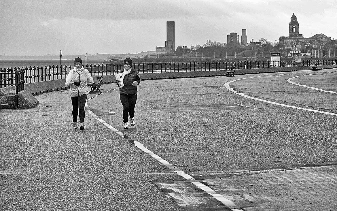
This photograph is not too bad, it works best in monochrome.  I noticed the lines in the promenade first then  saw the joggers coming so waited for them to come closer before pressing the shutter.  Looking at this image now, the lines are taking the eye out of the picture, which of course is not what was intended.


    Horizontal lines:


This photograph also relies on a line in the road but unlike the one above this has worked much better.  The red line I feel is vital to this image, I've included a copy without the line, for comparison.  The image is helped by the man walking, his jeans, being a similar shade of blue to the car on the left, give balance to the photograph.  This could also be a picture with two points, so would have fitted in the previous assignment.  However as the exercise is about lines, its strength is still the red line in the road.


Something a bit different now, I saw the above in a vehicle breakers yard, close to Birkenhead docks.  As soon as I saw the lines of car doors, all different colours, I felt it fitted perfectly into this exercise.  Although I am drifting away from my theme, the sea, all the photographs have been taken within the area of the Wirral coast.


The line of tyres are hung along the dockside of the West Float, a part of Birkenhead docks.  I feel this photograph fits the criteria for this exercise, but is not very creative.


I saw these people exercising on New Brighton beach, I felt they had a relationship to the wind turbines on the horizon, their movements being very similar to the rotating blades.  This photograph was taken from the promenade, it would have been better had I taken it on the beach, at their level.  Before I could get  down the steps the training session had finished and the line of people broke up.

Vertical lines:


The Light is a new cinema on the sea front at New Brighton, it's part of a large development which I guess the local council are hoping will revitalise this Victorian seaside town.  The early morning light was catching the side of the new building, highlighting the sign and the dark vertical stripe.  The design of this development is in stark contrast to everything else on the seafront, although not obvious from this photograph, the building is almost white so stands out from everything round it.

The Mersey Arms on the corner of Neptune street Birkenhead.


In complete contrast The Mersey Arms could never be described as bright and modern, it has now become a blank canvas for the local graffiti artists.  The Over Lords I must assume are a local gang. Was black the only colour of paint they had?  Or did they intend their art to match the pub's paintwork!  Looking at this image now, it's the graffiti that catches the eye, however when I took the photograph, it was the black pillars that drew my attention.


I saw the reflections in Birkenhead's East Float dock, and thought they might be a good example of  vertical lines.  On the far left can be seen the Anglican cathedral, across the Mersey in Liverpool.  To the right is a building known as the Central Hydraulic Tower, from here the dock gates and lifting bridges were powered.  The last reflection, made by the two dockside cranes completes the picture. I'd like to think the cranes are lined up because the drivers have pride in their job, it has helped this photograph.  There is a diagonal element to the image, which I hadn't noticed until I looked at it on the computer, maybe it would have been better if I'd used it in that exercise.

Me and my shadow.
This is my dog Millie, it was her shadow that caught my eye, I thought of it as a diagonal image but have changed my mind because the vertical lines in the sand seem to be more dominant, so make it suitable for vertical lines.