Thursday 30 August 2012

Exercise:- Colour relationships.

Hues vary from dark (such as violet) to light (such as yellow), to make the most of the harmony between any two complementary colours, you need to take account of the relative brightness.  With red and green, the brightness is the same, but orange is approximately twice as bright as blue, yellow about three times as bright as violet.  As a result, the ideal proportions for how much each colour occupies in the frame would be:
  • Red: green     1:1
  • Orange: blue  1:2
  • Yellow: violet 1:3
These ratios were first suggested by the German poet and playwright J. W. Von Goethe when he assigned the following values to the six colours: yellow 9, orange 8, red and green 6, blue 4 and violet 3.

The exercise is in two parts.  The first is to produce one photograph for each combination of primary and secondary colours, adjusting the distance, focal length or framing when you shoot so that you compose the picture to the proportions listed above - or at least close to them.

For the second part, the rules are not so strict.  Produce three or four images which feature colour combinations that appeal to you.  They can be combinations of two colours or more.  The object here is to demonstrate that there is no single ' correctness' to complementary colours, but be aware of any imbalance in the combination and study its effect.


Red and green.


Orange and blue.

Yellow and violet.

The second part of this exercise, colour combinations that appeal to me.

Below I've given the reasons why I chose the following four photographs but first the colour balance.  The first three are balanced in their own way, with the  pictures of sailing boats, the colours are almost the ratios suggested by Von Goethe.  In the third picture white and gold help correct the imbalance between red and blue,or it might be that I am used to seeing these colours together so accept the proportions.  The colours in the last photograph  grabs your attention, but unlike the previous images have no balance that I can see.  The small yellow flowers do help lift the picture somewhat.

Pink and yellow.

Blue and pink.

Red, white and blue.

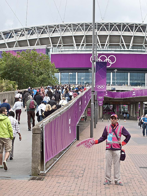
Pink and violet: Olympic colours.

The exercise says: produce three or four images that feature combinations of colours that appeal.  The pictures above caught my attention when I first saw them, they don't necessarily appeal, but do convey a strong message.  The first two photographs of the sailing dinghies were taken on a very overcast day, everything seemed flat and uninteresting, until I saw the boats on the lake, the fluorescent colours of the sails, really stood out, they lifted my spirits on what was a very dismal day.  The next two pictures were taken during my visit to London for the Olympic games.  The Town Crier, dressed in red, white and blue, the colours of the Union Jack, was an example of national pride, which seemed to be everywhere.  Next I saw the baskets of flowers, these were a perfect match to the colours of London 2012, again something that could be seen all over the city.  Together with the red phone boxes and London Bobby complete the scene, summing up my impression of London during the Olympics.   Obviously I'm attracted to strong, bold colours so I'm adding an extra photograph, something more subtle, just shades of green.

Greens at Angelsey abbey.

Wednesday 29 August 2012

The colour Yellow.

Since starting the Art of Photography course, the style and content of my photographs has completely changed .  For example I would always try to avoid having people in my pictures, wrongly assuming they would spoil the image I was seeking.  Of course most of the photographs were boring records of something equally boring.  Now I photograph almost anything, and since beginning this section, anything coloured and with any combination of colours.  I actively seek out people to include in my pictures and have found that if I wait a little while the right person will come along.  More often than not a scene that was a bit mundane can become interesting, exciting even.   I am doing nothing more than "street photography".  I know it's all been done before, but not by me, I'm getting a real buzz from it.  There have been many times when I've wondered if the course was worth it, and some would question if it was value for money.  If I was being honest then no it isn't.  On the other hand would I be getting a buzz from my photographs without doing it, again if I'm being honest, most certainly, NO.  Enough waffling, the reason for this post is the colour yellow and some of my attempts at this "street photography".  It all started with a yellow cone in the Bull Ring in Birmingham, then noticing that the colour matched some of the carrier bags people had, there was even a match with a woman's jacket.   This got me started looking for colour matches wherever I went as well as photographing other cones, which can be seen from the pictures below.


Bull Ring, Birmingham.


London's South Bank.


Blackheath.

The photographs in London were taken during the Olympics, I believe the cones around the South Bank were part of an art project, they were everywhere.  The picture at Blackheath was taken at 7am the morning after the opening ceremony.  Lewisham council had put up a big screen for the whole of the games, the night before, thousands of people had been on the Heath watching it.  The scene above was what was left behind, by 9am every bit had been cleaned up, a credit to the council workers involved.  I've included below a photograph taken the previous night, because I had to expose at 0.5sec f8 at 1600asa, the quality was not very good.


Monday 27 August 2012

Exercise:- Primary and secondary colours.

For this exercise find scenes or parts of scenes that are each dominated by a single one of the primary and secondary colours.  With every colour that you find, vary the exposure slightly.  Take the first exposure as the camera meter indicates, a second exposure half a stop brighter, and a third exposure half a stop darker, this will change the appearance of the colours.  One of the three will more closely match the colours in the circle below, for this exercise select whichever is the closest match.


I will put the colours in the order we usually refer to them, R G B.

                                                    RED                                                                              
Camera metered exposure.

Half stop lighter.

Half stop darker.

None of the photographs used have been changed in any way, they were taken as raw files, converted to TIFF's and sharpened in Photoshop.  I used a Polarising filter when taking all of the images, I find this gives better and truer colours.  Of the three red pictures, I feel that the exposure at half a stop lighter is closest to the red on the colour wheel. 

                                            GREEN
Camera metered exposure.

Half stop lighter.

Half stop darker.

The photograph taken at the camera's metered exposure is closest to the green on the colour wheel.  There is only a slight variation between the images when an exposure a half stop darker was used, only in the shadow areas can I see any difference.  There is however a noticeable difference with an exposure a half stop lighter.

                                                 BLUE
Camera metered exposure.

Half stop lighter.

Half stop darker.

A half stop darker appears closest to the colour wheel, for blue, I can see a greater difference between each image than I could with the green photographs.

                                                Yellow
Camera metered exposure.

Half stop lighter.

Half stop darker.

I chose lichen as the subject for yellow, the lighter one is closest to the colour wheel, again a noticeable difference between each of the images.  The camera's meter could have been influenced by the grey concrete wall on which the lichen was growing.

                                               ORANGE
Camera metered exposure.

Half stop lighter.

Half stop darker.

I photographed this L P G tanker on the river Mersey for the orange subject.  The picture taken a half stop lighter looks almost the same as the orange on the colour wheel, there is considerable difference in the colour of the lighter and darker images. The shade of orange in the darker photograph could be mistaken for red.

                                                 Violet
Camera metered exposure.

Half stop lighter.

Half stop lighter.

The camera metered exposure looks about the best match to the violet on the colour wheel.  I'm not sure how much the weather has affected the colour, it was very overcast when the pictures were taken.  Again a marked change between all three images.

Conclusion:-

After looking at the photographs of the six colours, it is my opinion that the variation in exposure has resulted in the following. One at a half stop darker, two at the camera metered setting and three at a half stop lighter, seem to match the colour wheel the best.  The darker violet image is somewhat drab, as I said before it may be because all except the violet pictures were taken in good light, I cannot be sure how much this has affected the result.  All the colours show an obvious difference between the exposures apart from green, when the camera metered exposure and half stop darker are very similar, the shadow areas are perhaps the only variation.  The half stop lighter or over exposed photograph is noticeably lighter, I had to check the camera metadata to see if I had exposed it correctly.  The greatest variation seems to be between the lighter and darker orange ship photographs, as I said before the dark one is almost red.


Friday 24 August 2012

Project:- Building a Library of colours.

                                                       Colours of 2012

Assemble a collection of photographs that individually feature, or are dominated by, a distinct colour.  The more you train yourself to recognise colours, the greater your sensitivity will become.  The colour library will help, treat it as a continuing project.  

I have taken so many photographs for this project, far more than I could show on my blog so I have included   examples of the pictures in my library.  I was fortunate to be in London during the Olympics,  colour could be seen everywhere and some of the photographs are below.


The lights of London


I'm enjoying this part of the course and hope this comes across in my photographs.  Recognising the different hues has become a lot easier.  I've added a picture below which was taken on the Millenium Bridge in London.  Not the best of photographs, but hope it illustrates my point,  the woman's coat was almost the same colour as the Olympic sign on the wall of Tate Modern.   Finding the right combinations of colours for the next exercise is proving a lot harder, but at least I'm having lots of fun finding them.

Pink at the Tate