Let there be Light.
Exercise 1: Measuring exposure.
 |
| Tulip stair in the Queen's house at Greenwich. |
'For the first part of this exercise produce four to six photographs which are deliberately lighter or darker than average, say why in written notes'.
'Secondly produce at least 36 photographs of any subject, for each one make five exposures arranged around the best measured exposure. The first should be one stop darker, the second half a stop, the third average, the fourth half a stop lighter and the fifth one stop lighter. When viewing the images see whether or not the central exposure is, as you would expect it and what you wanted. Next, which, if any of the other exposures are also acceptable? Depending on the subject and the kind of lighting, you may find some differences'.
This is part of the brief taken from the course book for this exercise. With the exception of one of the photographs they were taken in Liverpool, most of my time was spent around the Pierhead and along the Mersey river front. This area is a wonderful mix of old and new buildings, somewhere I will certainly be visiting again.
Taken from Grenwich park, not the best shot of the London skyline however I wanted a photograph that included this amazing sky. The wind was blowing the clouds across quite quickly so I only had seconds to take this. Luckily the best light is behind St Pauls, I waited, hoping it would move across to the Shard, sadly it didn't. The thing that strikes me about this view is how many cranes there are in London, assuming they are all on construction sites, one might say, recession what recession! Returning to the exercise, I exposed for the brightest part of the sky, because that was the main reason I had for taking the photograph, I knew this would put most of the scene into silhouette, with such a well know skyline I didn't think this was a problem.
With the remainder of the photographs I have included an image that was exposed at the camera's metered setting for comparison. The darker of the two pictures above is closest to what I had seen at the time, the sky looked almost on fire, like the previous photograph taken in London, the sky was the most important element.
The top, darker photograph is how I saw the scene at first, the sun was highlighting the ferry boat, this side of the river was in shadow. When the cloud drifted away the lighting was more even, still an acceptable image but not as interesting as the first, darker one.
My intention was to expose for the reflections of the older stone buildings, as seen in the modern glass architecture. The lighter photograph works best and is nearest to what I saw, unfortunately the sky is washed out also some of the rich colours in the trees has been lost.
I saw this broken and abandoned umbrella in a park near Lime St station, it's purple handle really stood out. I thought it looked very forlorn just lying there, it must have broken in a gust of wind, its owner in a fit of temper just threw it down. No thought that someone will have to clear it up or of how many times it must have kept the rain off them and maybe it could be repaired. I'm wittering on again, the bottom, metered exposure is correct for the stonework but the umbrella is a bit washed out. In the top darker image the colours and umbrella skin look much better, detail in the stonework is lost but it's not relevant to this photograph.
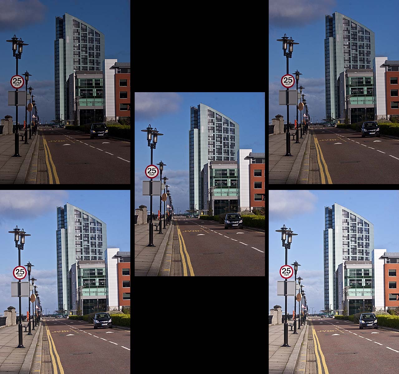
The second part of the exercise: Multiple exposures.
Each group of images is laid out in the same way: top left and right, one stop and a half stop darker respectively. The central image is taken at the camera's metered exposure, the last two photographs in each group are, on the left, a half stop lighter and on the right one stop lighter. The auto bracket on my camera only takes three exposures so for each set I took six images, then deleted one of the camera's exposures which of course had been duplicated. Because one set was bracketed by one stop and the next by half a stop, anything moving, for example people within each scene appear to jump around or in some cases disappear.
This scene has quite a lot of contrast, so I had expected problems with it. The metered exposure is on the whole acceptable but a bit flat, I like the foreground and bridge in the one stop lighter image if it was combined with the sky and background of the half stop darker photograph.
If the pictures were numbered with one being top left, two top right, three in the centre, four and five are bottom left and right. I find numbers three and four to be very similar and exposed ok. One and two are much too dark with five being too light.
Image number four, a half stop lighter, seems about the best in this set when viewed at this size however the average exposure might look better if enlarged.
Again photo's three and four are acceptable, the last few images were all taken around the same time, midday, all have even lighting coming from over my shoulder, they are all a bit boring, probably due to the angle they were taken from.
This was taken with the sun at a different angle, coming from my left side, this is obvious by the shadows. The camera's metered exposure is my favourite, good strong colours, with plenty of detail and shadows.
This is the new Museum of Liverpool, the photographs were taken with a polarizing filter on the lens, without it the glass in this building looks black, I prefer this effect. The sun was at the front and side, this can be seen by the angle of the shadows. It was glancing off the side of the Museum, so the windows are reflected in the block paving. The first three images are quite good giving the effect that I was hoping for although I would have liked some figures in the foreground.
This time the sun is shining straight down the Albert dock promenade, again the shadows show it's position. I had to turn the camera slightly to one side, so as not to get flare in the lens. All but the last image are of an acceptable exposure, I like the way the light shows all the detail in the cobbles.
The shadows show that the sun is coming from the right hand side this time, this I feel has given a 3D effect to the picture, unlike some of the earlier images where the sun was behind the camera, they were very flat! Photographs two, three and four are all quite good, the camera's metered exposure probably has the edge, proving that its metering system is fairly accurate.