Monday 19 March 2012

Project: Rhythm and Pattern.

Exercise:   Rhythms and Patterns.

Produce at least two photographs, one should convey rhythm, the other pattern.  Remember that in rhythm there needs to be a sequence in the picture, so that the eye will follow a direction and experience an optical beat.  Patterns work strongly when they fill the frame, so that the eye can imagine them continuing well beyond it.  


Percy the pigeon.


Taken at the same place as the photograph of "Percy".  They are both sections of the Tower road bridge at Birkenhead docks which I have used as a subject in other exercises.  I think the rivets and shadows make a very good pattern, had it not been sunny I might not have seen this image.  I will include a photograph of the whole bridge at the end.


I found it difficult to come up with pictures showing rhythm so I've included two.  Sometimes I look at this and see what the course book says, that there should be a sequence within the image.  The same applies to the photograph below, looking at the highlights running from top to bottom, I can see a sequence, but looking horizontally I can see a pattern.


Tower road bridge.
Now for assignment 2, which will be sent to my tutor on a memory stick, if I have the time I will add it to this blog.

Project: Shapes.

Exercise:  Real and implied triangles.


Spot the triangle!!!

Produce two sets of triangular compositions in photographs, one using 'real' triangles, the other making 'implied' triangles.

Real:

  • Find a subject which is itself triangular (a detail of something larger will do).
  • Make a triangle by perspective, converging towards the top of the frame.
  • Make an inverted triangle, also by perspective, converging towards the bottom of the frame.


Taken at Birkenhead, this steelwork forms part of the lifting bridge that carries Duke Street across the entrance to one of the docks.  Once I started looking, there were triangles all over this structure.  It would have been better had I used a slower shutter speed, some movement in the car might have given the image a bit more impact.


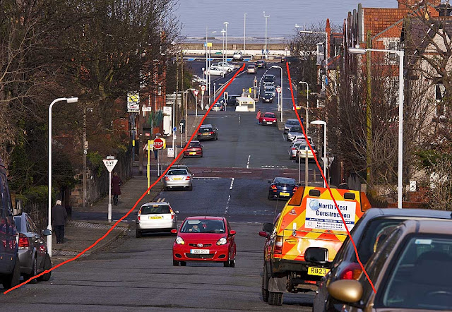
This was taken with my 70-200mm lens, looking down Atherton Street towards the promenade at New Brighton.  I realise now that I should have used a wide angle lens, using a telephoto has compressed the scene, so completely changing the perspective.  Lines have been added  to the image below, I hope they show what I was trying to convey with the photograph.


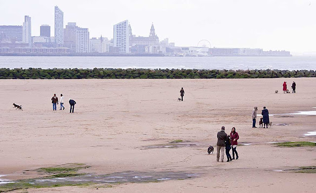
Until I started doing these exercises, I'd no idea how many shapes could be seen in everyday situations, like this one of dog walkers on New Brighton beach.  It was not a very good day, weather wise, but when taking this photograph I knew it had worked.  Just at the moment the shutter was pressed, the dog walkers moved into position, almost like formation dancers in a ballroom competition.  In actual fact only two of the groups are moving, the people on the right are stationary, they appear independent of each other, but at the same time there is a connection.  They are all talking, they are all in a line and will probably all go the same way down the beach.  Again I have included a picture with a diagram showing the relevant shape.


Implied:

  • Make a still-life arrangement of five or six objects to produce a triangle with the apex at the top.
  • Make a still-life arrangement as above, but so that the triangle is inverted, with the apex at the bottom.
  • Arrange three people in a group picture in such a way that either their faces or the lines of their bodies make a triangle.


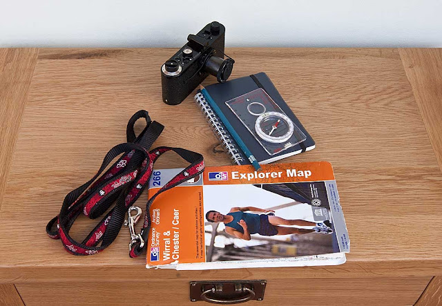
For the still life I chose a few of the things that I take with me on my trips to get images for the course, therefore  keeping to my theme, the Wirral.  The camera is obviously not the one used every day, but one that I am fortunate to own.  It is a fully working replica of Oskar Barnack's O-series camera, it was re-produced by Leica in 2004.  The triangular shape to the set-up can easily be seen, however a diagram is included alongside each photograph.


I then rearranged the components of my still life, so the apex was at the bottom.


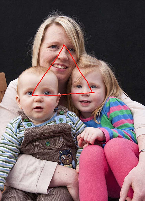
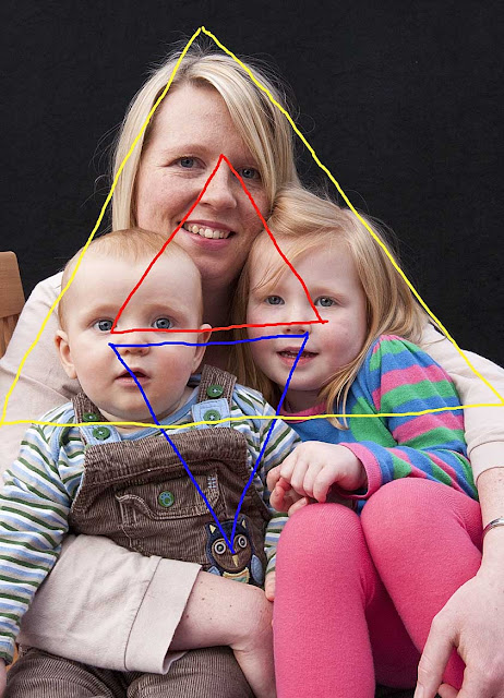
For the last image in this exercise, I photographed my grandchildren, Izzy and Jacob with their mum.  The set up is a natural one, all I had to do, was to get them to sit against a black background therefore keeping it simple.  There are several triangles within this picture, so as with previous photographs I have included diagrams.


Before starting part two of this course I was aware of how important composition was to a photograph, but not to what degree.  Shapes, I now know are a vital ingredient in any picture, I'm sure they will become the norm in my photographs from now on. When reading through Elements of design, I thought finding photographs of triangles, for example, the most difficult, in fact it turned out to be a lot easier than I had imagined.  I now see triangles in lots of things, and along with implied lines, the pictures I am now taking seem to be full of them.  Out of all the exercises I have done, curves gave me the most trouble, despite thinking that it would be one of the easier ones.  Still life has again given me a challenge, I can see how it can be very satisfying when done correctly, also how the shape of it is so important to the final result.

Friday 9 March 2012

Project: Using lines in composition.

Exercise:    Implied lines.


Start by looking at these two photographs and find the implied lines in each, showing them in a small sketch diagram.  If one direction along a line is dominant, indicate this with an arrow.


 Then find three photographs of your own, and perform the same analysis.  


This was taken at St Pancras station before it became the London terminus for Eurostar.  There are several lines leading to the main subject, the train.  The shadows cast by the trolley, lead the eye, but more important I feel the angle of the doors direct you through the image.


I visited Glasgow in 2008, quite some time I know since it had been City of Culture in 1990.  This image I felt was such a contrast, showing a side of the city that I hope very few visitors see.   Although the woman in the red coat has her back to the camera, it is obvious that she is looking at the poster, so there must be an eye-line from her towards the woman on the advertising hoarding.


Walking down Brick lane in London's East end, I spotted this scene.  At the time I hadn't realised it's significance, but knew there was something I liked about the image.  I can know see that there are three eye-lines in this photograph.  The woman holding the ladder, the graffiti on the wall and the sheep's head, all have eyes looking at the man trying to put up some sort of flag.


For the third part of the exercise, plan and take two photographs that use the following kinds of implied lines to lead the eye:

  • An eye-line
  • The extension of a line, or lines that point.


Could it be that I am attracted to the colour or is red just very popular, so many of my photographs have red somewhere in them.  The low afternoon sun is making long shadows, that lead the eye to the couple, who, judging by all the bags, have been shopping.  The man's red coat is the main focal point in the photograph, so maybe the shadow lines are not really that important to this image.


This is the final photograph in this exercise and my example of an eye-line.  At first it may not be very obvious that the figure is that of a fisherman.   His eye's are concentrating on the end of the fishing rod, that is resting on the bike, watching for any movement which would indicate he's caught a fish.  This is making a very definite eye-line, there is also a triangle in this picture, formed by the fisherman, the tower and the push bike.

Wednesday 7 March 2012

HMS Liverpool comes home.


The type 42 destroyer HMS Liverpool, has made a last visit to her home port before being decommissioned, she was built at the Cammell Laird shipyard in Birkenhead, and entered service in the 1980's.  The photograph taken on 3rd March is made up of 6 images, which were then stitched together in Photoshop.  I wanted to show as much as possible of the Liverpool skyline, so making a panorama like this was the only way.  Below are the images I used to make up the above picture.


Monday 5 March 2012

Exercise: Curves.


Curves, like diagonals, have a sense of movement and direction, and in some ways can be considered a kind of diagonal line.  Because they pull the eye, they are useful in planned composition. Curves have associations of smoothness, grace and elegance, so add these feelings to an image.  For this exercise look for and take four photographs using curves to emphasise movement and direction.


When does a curve become a circle?  That's the question I asked myself when I took this photograph of an old wagon turntable on the dockside at Birkenhead.  I'm was not sure this could be included in this exercise so have looked for other examples of curves, something I found to be a challenge.


I had originally intended this image to be one of the "vertical lines".  However I can see curves in this photograph so felt it fitted well into this exercise.  Both the roundabout with the chevrons on, and the road sign showing directions from the roundabout, convey movement in a circular manor.


This is a rather boring photograph, it fits some of the required criteria for this exercise, but does not convey any sense that the train is moving.  It was coming into the station very slowly, so I was unable to show any sense of speed or movement.


The water left behind when the tide went out, has formed a nice curved line.  The image is improved because the person walking their dog in the distance is wearing a red coat, another example of how a strong colour can help a photograph.  The water leads the eye towards the dog walker, so the curve is giving a sense of direction, but again, there is no impression of movement.  Even though the figure is very small within the frame, the red coat will always catch the eye, so the curved line is not really essential.


The boat having just turned around has left behind a curved wake, which when combined with the boats bow wave, conveys a sense of movement.  Not I'm afraid one of my better photographs.


For me this is a much better photograph, the colour red again!  There are lots of curves to be seen.  Firstly the railings are on a bend in the road, also they have a curved design along the top, which is then repeated in the shadow on the pavement, finally there is a curved shadow down the centre of the pavement.  The cars in the background are blurred, so give the  impression of movement.  I pressed the shutter a little early, and would have preferred the grey car to have been a bit further round the corner.


Of all the photographs taken with this exercise in mind, I feel this is the best.  I've used a slow shutter speed to blur the movement of the car, the arrow on the blue sign and chevrons on the roundabout, both imply  direction.  Also I used a wide angle lens, which has helped to show the curve of the road.  The welcome to New Brighton statue on the roundabout sets the scene for my theme of the Wirral coast, and to cap it all the car is RED!!